
主要有六种方式
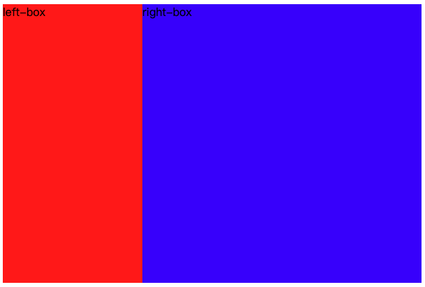
效果如下
html代码
<!DOCTYPE html>
<html lang="en">
  <head>
    <meta charset="UTF-8">
    <meta name="viewport" content="width=device-width,">
    <title>左边定宽右边自适应</title>
  </head>

  <body>
    <div class="box">
      <div class="left">
        left-box
      </div>
      <div class="right">
        right-box
      </div>
    </div>
  </body>
</html>
float + calc
样式如下
.box {
  width: 600px;
  height: 400px;
  border: 1px solic #000;
}

.left {
  float: left;
  width: 200px;
  height: 100%;
  background: red;
}

.right {
  float: right;
  width: calc(100% - 200px);
  height: 100%;
  background: blue;
}
inline-block + calc
.box {
  width: 600px;
  height: 400px;
  border: 1px solic #000;
}

.left {
  display: inline-block;
  width: 200px;
  height: 100%;
  background: red;
}

.right {
  display: inline-block;
  width: calc(100% - 200px);
  height: 100%;
  background: blue;
}
position + padding
.box {
  position: relative;
  width: 600px;
  height: 400px;
  border: 1px solic #000;
}

.left {
  position: absolute;
  width: 200px;
  height: 100%;
  background: red;
}

.right {
  padding-left: 200px;
  height: 100%;
  background: blue;
}
flex 布局
.box {
  display: flex;
  width: 600px;
  height: 400px;
  border: 1px solic #000;
}

.left {
  width: 200px;
  height: 100%;
  background: red;
}

.right {
  flex: 1;
  background: blue;
}
table 布局
.box {
  display: table;
  width: 600px;
  height: 400px;
  border: 1px solic #000;
}

.left {
  display: table-cell;
  width: 200px;
  height: 100%;
  background: red;
}

.right {
  display: table-cell;
  height: 100%;
  background: blue;
}
grid 布局
.box {
  display: grid;
  grid-template-columns: 200px auto;
  width: 600px;
  height: 400px;
  border: 1px solic #000;
}

.left {
  background: red;
}

.right {
  background: blue;
}
小结
不严格实现方案
- float + calc
- inline-block + calc
- position + padding
严格实现方案
- flex 布局
- table 布局
- grid 布局